Do you follow the color trends or do you find yourself picking out the same colors year after year?
From flowers to clothes, home decor, and if you have one…your business.
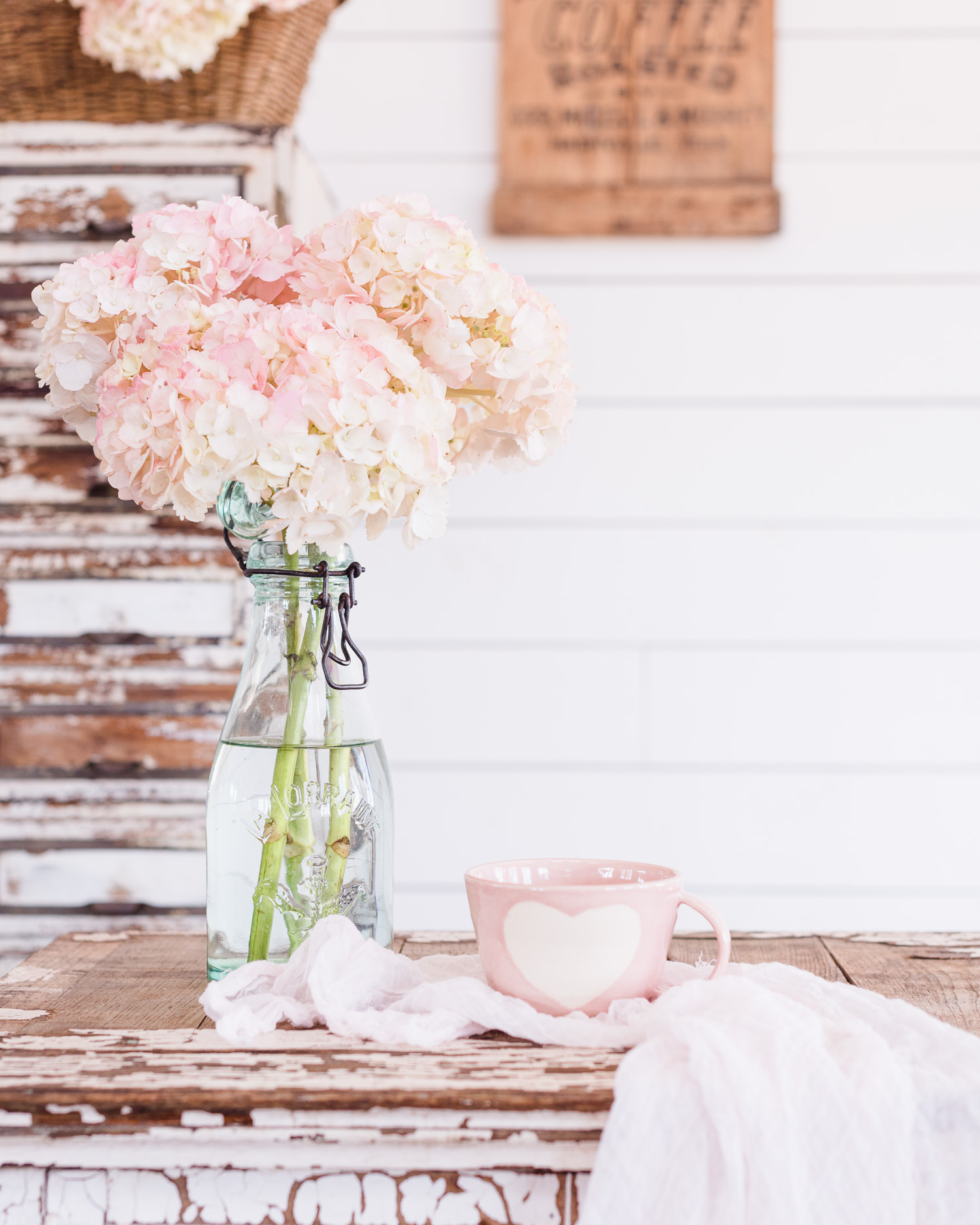
When I looked at this photo it got me thinking about my natural tendency towards muted pinks, weathered wood, and whites.
These are some of the colors I photograph often and yet I don’t decorate our home with pink unless it’s in my studio.
I lean towards natural decor and when it comes to photography I love color.
Especially soft colors.

This is part of my favorite color palette regardless of the season.
Light colors feel like a breath of fresh air, feeling simple and less heavy.

However, like most creatives I love everything.
Often enjoying dark and moody, bold and bright…done so well by others.
I dabble once in a while especially in the fall and winter, but I always find my way back to light and dreamy.
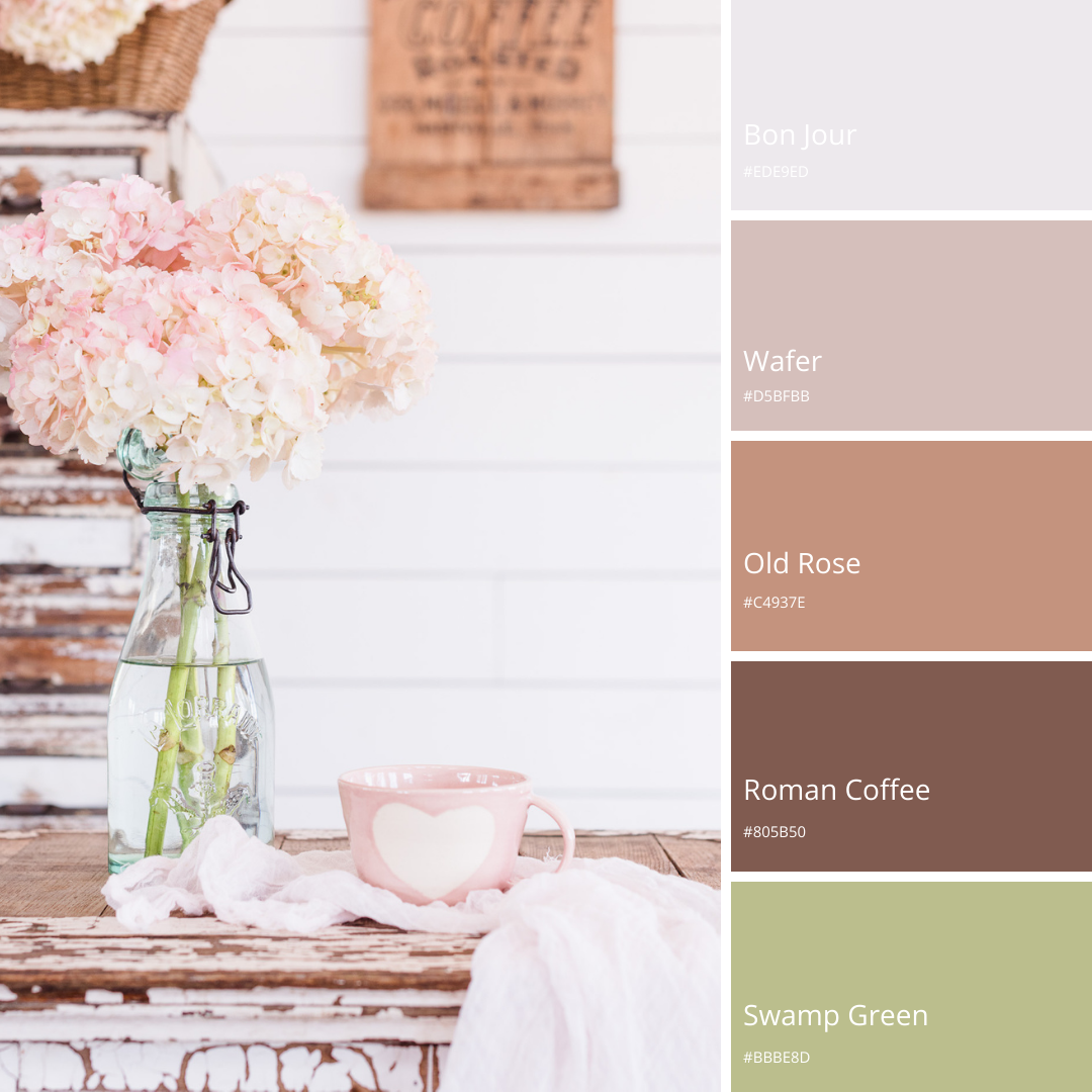
For fun, I created this in Canva.
If you would like to create your own go to grids (grids is located under elements) and find a template you like and upload your image.
Once uploaded click on the color picker in the top left.
You’ll then see a series of colors that have been extracted from the photo.
It was interesting to see what colors came up in this photo.
Even though I like soft colors you can see the rich colors that are within the photo.
Use it for inspiration or gathering ideas for your brand colors.
If you don’t want to create a photo, but you’re intrigued go to Canva Colors Palette Generator and upload a photo.
The upload is fast and you can play around uploading different photos and seeing the color palette it creates.
Kindly, xo
Jane
p.s. in case you missed the spring iPhone Wallpaper for March
4 Comments
That’s so cool! Technology is amazing, and you’re right, I would have expected a lighter pallet to be extracted. 🙂
I hope you give it a try Kim with one of your styled painted furniture pieces!
Such a pretty color palette! I’m drawn to more muted colors also. I’ve been lightening up my decor lately and I find myself adding muted color to it here and there. I am working on pieces I had found while thrifting years ago that I love but toning down the colors and I love the results!! Beautiful post Jane!💕
Hi, Lynn
How wonderful that you’re adding pieces you found years ago.
I often find that I don’t know where a piece fits right away, but one day it finds a home.
xo